Functional design: why does it matter for digital entrepreneurs?
Want to make your website more intuitive and effective? Learn the principles of functional design and transform your online presence. Read the full post now.
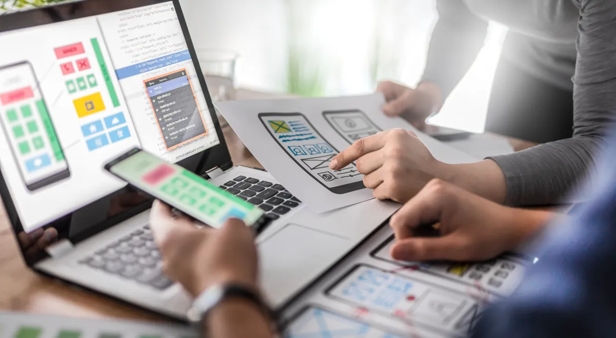
Sometimes what drives a customer away isn't the price, the offer or the content. It's how hard it is to find the right button. The functional design of a website or app plays a direct role in the visitor's experience and, of course, in the seller's results. For digital entrepreneurs, this isn't a minor detail. It's the foundation.
When the visuals are clear, organized and easy to use, visitors can get where they need to go effortlessly. And the fewer obstacles they run into, the more likely they are to complete an action.
In other words, good design isn't just there to look nice. It's there to guide, simplify and drive conversions. Read on to discover our tips and put them into practice.
So, what is functional design?
Good looks alone don't guarantee a good experience. In some cases, they even get in the way. When it comes to a website or app, what really matters is how everything works in real use. A layout may grab attention right away, but if the navigation is confusing or visitors get lost, the positive effect disappears.
Functional design puts usability front and center. It's built to make life easier for visitors, helping them find what they're looking for with minimal effort. More than appearance, it values clear and smooth paths.
So it should have the following characteristics:
- visual organization that makes reading and navigation easier;
- a clear, straightforward information hierarchy;
- well-placed buttons that are visible and easy to spot;
- an intuitive structure that takes no effort to understand;
- light, fast loading;
- adaptation to mobile, tablet and desktop;
- visual elements used with purpose, not just for decoration.
A good example is a simple sign-up page, with straightforward fields, clear instructions and a prominent button that guides users to the end of the process. Menus placed where visitors expect to find them, headings that show what's coming next and visual cues that lead without confusing are also part of this approach. That's design that works.
Why is functional design so important?
First impressions still count, but they aren't everything. A good-looking website or app catches the eye, but what really keeps people there is the experience. When everything seems to be in the right place and works effortlessly, people are more likely to complete an action, keep browsing or even recommend it to someone else.
In digital entrepreneurship, where every click can mean a sale, a new contact or an opportunity, functional design becomes critically important.
That's because it directly affects how the audience perceives the brand, how they feel while using it and how they respond to interactions. Below are the main benefits of this approach.
Easier for visitors
People who visit a website or app don't want to waste time figuring out how it works. The more direct the path from arrival to the desired action, the better. Well-planned design reduces the need for explanations and lets navigation happen naturally.
This reduces frustration, prevents drop-offs and makes for a lighter experience. Visitors feel in control and can get what they need done without effort. That increases time on site and opens the door to more interactions.
Higher conversion rates
A visitor who finds a clear path to the buy button or contact form tends to complete the action more often. Functional design removes invisible barriers, such as confusing menus, poorly laid-out text or hidden buttons, that can get in the way of a decision.
This kind of structure encourages more targeted clicks, improves page performance and, in many cases, helps boost sales. When a digital space respects visitors' time and attention, results show up more consistently.
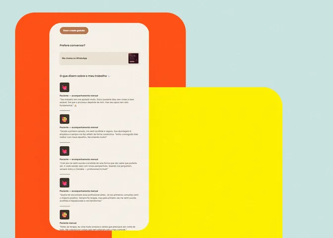
Your minisite can be more direct, beautiful and functional. Visit Keepo and find out how to create a page that truly makes navigation easier.
Better brand perception
The way a website or app works sends a message. When everything flows well, the brand conveys reliability, attention to detail and respect for the user. This reinforces a professional image and strengthens the audience's trust.
Smooth navigation and organized visuals show that care went into the development. And that, even subtly, helps build a positive relationship with the person on the other side of the screen. Design doesn't speak, but it communicates a lot!
Fewer questions and unnecessary support
When information is easy to find and steps are clear, the number of questions drops. This takes pressure off the customer service team and makes better use of the company's resources. Functional design anticipates needs and clears small obstacles before they turn into problems.
Fewer messages asking for help finding a button or understanding a process means more free time to take care of other parts of the business. It also shows that the digital channel is doing its job well.
Easier adaptation to mobile devices
Most traffic today comes from smartphones. Functional design takes this into account from the start. It arranges elements so they stay accessible on different screen sizes, without straining the eyes or requiring awkward clicks.
Besides improving the user experience, this flexibility also helps with search engine rankings, since responsiveness is one of the criteria evaluated by platforms like Google. In other words, taking care of form also helps your reach.
How to achieve functional design
Having a website or app that works well for visitors isn't just a matter of good taste. The secret lies in making decisions based on usability. That means looking at the structure, the paths and the navigation logic before thinking about visual details.
Functional design starts with intention. For it to truly work, every choice needs a reason: making reading easier, guiding the user, highlighting what matters most.
It's not about cramming the screen with elements or following trends. It's about understanding what helps, what gets in the way and what can be improved with small changes.
Here's what you can do, in practice, to make your digital space clearer, more efficient and more pleasant for its users.
Organize content by order of importance
Everything on a page should follow a logic. Not everything needs the same visual weight or the same prominent position. By organizing information from most important to supplementary, you make it easier to understand and guide visitors more clearly.
This hierarchy can be created with text size, colors, white space or element placement. The goal is simple: people shouldn't have to think hard to know where to start. If the most important content comes first, the flow happens naturally.
Choose readable, pleasant fonts
The way text looks directly affects reading. Fonts that are too small, overly decorative or low in contrast make comprehension harder. Visitors end up wasting time trying to understand, or worse, give up altogether.
To keep content accessible, choose fonts that read well on different screen sizes. Use colors that contrast well with the background and leave space between blocks of text. This combination improves the experience and holds attention longer.
Make navigation easier with clear menus
A well-built menu saves time and prevents frustration. It should be straightforward, easy to find and use labels that make sense to visitors. Avoid technical jargon or generic categories. Choose words that clearly show what will be found in each section.
Hidden, confusing or overloaded menus end up diverting attention and making the journey harder. Remember that people who visit your site want to find something, not solve a riddle. Guiding with simplicity is what keeps navigation smooth.
Want to create a minisite that's easy to navigate and beautiful to look at? With Keepo, you can build everything simply and functionally. Visit the site and give it a try.
Use highly visible buttons with clear calls to action
Buttons are action points. They need to be easy to spot, with colors that stand out and text that shows exactly what will happen when clicked. Vague wording or confusing placement gets in the way and creates uncertainty.
The idea is that visitors shouldn't think twice before acting. If the button leads to a form, say so. If it completes a purchase, state it directly. Clarity reduces doubt and increases confidence in the click.
Use white space to your advantage
Not filling every corner of the screen is a smart design choice. White space, or negative space, helps highlight the main content, rest the eyes and organize reading. When everything competes for attention, nothing truly stands out.
Adding spacing between blocks, separating sections and leaving “breathing room” around elements makes the visuals more pleasant and functional. The page breathes better and visitors feel more comfortable to keep browsing.
Test, observe and adjust often
Functional design isn't done all at once. It evolves based on the real behavior of the people using the website or app. Tracking traffic, listening to feedback and testing small changes helps you understand what can be improved.
Sometimes a softer color, a repositioned button or a new content layout is enough to bring results. What matters is staying attentive and being willing to adjust, always focused on the visitor's experience.
A good product can go unnoticed if the user experience doesn't live up to what it offers. Functional design improves that perception and also provides the structure for actions to happen smoothly. When the visuals work together with the navigation logic, the website or app becomes a more accessible, intuitive space that's in tune with the person on the other side of the screen.
Being a digital entrepreneur requires conscious choices, and design is one of the first things your audience notices, even without realizing it.
Want to see how this can work in practice? Visit Keepo.bio and discover a simple way to build an effective digital presence.